Good graphic design
Product labels are everywhere. Labels are on almost every ‘thing’ you can buy. They describe the product, its benefits and uses and the ingredients. Labels display and sell the branding and ideals of the company selling the product.
Designing labels for product packaging is a process that should be carefully considered. The label can directly affect how your product is seen and could influence buying decisions.
Here we are going to look at the process of designing labels, in two parts. Firstly we consider the basic essentials required to produce a professional looking design. Once you have this part sussed, you can then let your creativity shine without overshadowing the purpose of the label.
ESSENTIAL POINTS WHEN DESIGNING
SOFTWARE
If you are only creating one label design, then it would be worth asking a professional designer to do this for you. Here at HD Labels, we can offer a design service so please get in touch for a quote. If you have several labels to create then you may wish to look into different software options, but we would definitely recommend using software either created for design or specifically for labels. Artwork supplied in ‘Word’ is generally not a good thing for you or us!
SIZE/SHAPE of label to fit on packaging
Measure your product container/packaging BEFORE you start the design, so that you know what label size will work. This could determine font size and if very small strip down bare essential info. An easy way to measure is to wrap a length of paper around the container and mark or trim it to the size that covers the area you wish to be labelled. You should measure the width and the height.
Image showing measuring
MOST IMPORTANT INFORMATION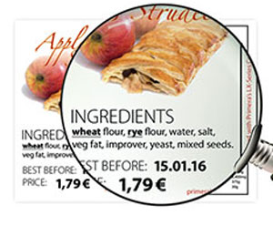
When designing your label, it is important to ensure that key information is included without overwhelming the label with text.
With too much text, your label starts to look cluttered and confusing. You should outline exactly what you need to include to help the customer make sense of the product. The most important information should be easy to locate on the label and easy to read.
Once the essential information is established, the rest of the design can take shape. You need to include your branding, which could be a logo, font style or specific colours. There may also be room for some imagery too, but make sure your text is still visible and don’t be afraid to leave some blank space as well.
CONSISTENCY
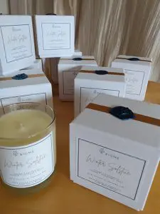
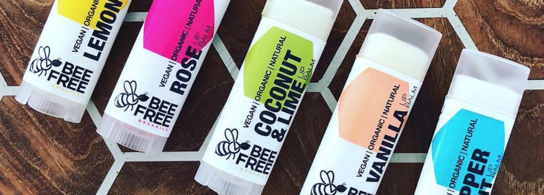
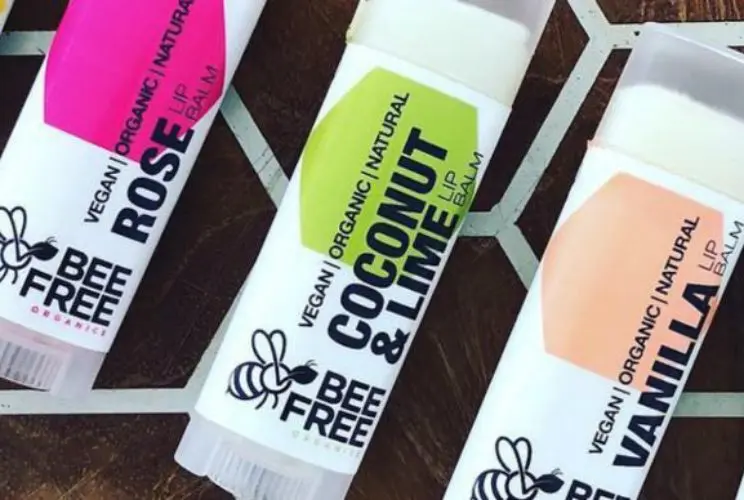
All products within brand should look like they belong together. Smaller labels may need a simplified version of the logo in order to be visible at a smaller size. Don’t squash or stretch the logo to fit! Colours, fonts and the general theme should be consistent throughout the range of labels so that they work as a set and can easily recognisable.
READABILITY and REGULATIONS
The brand name and product name should be visible from a distance. If using coloured text or text on a coloured background, then this must be easy to read with a contrast between the two. Some products may require text to be of a certain size, so it is advisable to check this before you begin.
FONT USAGE
Make sure the text can be read. Print the artwork before finalising to check it is legible. If a font is very fine then it will not print well at a small size.
Don’t use too many different fonts – 2 or 3 at most, but make use of fonts with different weights. You could use CAPS for product name or for headings such as ‘Ingredients’. Consider pairing a cursive font with a bold, sans serif for variety. BUT legibility is essential.
Image of complimentary font usage
WORK IN CMYK colour if possible
Labels (and other printed material) are printed in CMYK (cyan, magenta, yellow and black). Every colour printed is a combination of these 4 base colours and this can sometimes look very different on a computer screen. Screen based images are RGB (red, green, blue) and are often very bright on screen, but when printed look dull and washed out in comparison. Greens, oranges and purples are colours that are commonly very different when printed and this could lead to disappointment. If in doubt, it is always a good idea to print your design (or request a printed sample) to check the colour is as expected.
Image showing difference
USE GOOD QUALITY IMAGES
If you must use a pixel-based image (eg. A photo or jpeg file) rather than a vector-based image, then make sure it is of good quality and size. Ideally 300dpi at 100% size. Even though labels are generally small, a beautiful design can be ruined by a fuzzy, pixelated image. Vector images can be enlarged to any size without losing quality and are clean and crisp, so these are always preferable.
Low res vs high res image
ADD ‘BLEED’ to the finished label size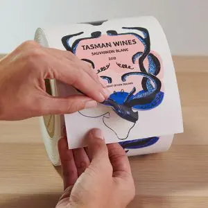
A design will ‘bleed’ when part(s) of the design go fully to the edge of the label dimensions, therefore the design needs to be set up larger than the finished size with any necessary elements extended slightly beyond the dimensions of the finished label.
This is done to ensure that there are no visible white borders when the printing process is complete and the label is die-cut along the cutline. When you receive a proof of your label, you will see it is set up with the bleed outside of the cutline. The cutline is shown so you know where the label will be cut from the excess material.
CONVERT TO OUTLINES
Converting your text to outlines means that the software will no longer recognise the text as a font, ensuring there are no print errors like missing fonts or font substitutions. This occurs when the production software does not have the same fonts as you have used, and it can cause big changes to the design. When converting to outlines, make sure that you save the ‘outlined’ version as a new file, so that your original artwork can still be edited as needed.
Image showing missing fonts
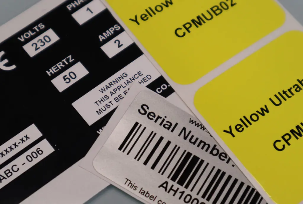
SPACE FOR BARCODE
Remember to allow space for your product barcode. Barcodes that are cropped or not crisp can cause issues throughout the stages of sale.
ONCE YOU HAVE THE ESSENTIALS SORTED, YOU CAN MOVE ON TO ADDING A CREATIVE TOUCH!
CREATIVITY IN DESIGN
Depending on the product, creative skills may be showcased or the design may need to be restrained and focus on the information and let the product do the talking. You need to think carefully about the purpose of the label before getting stuck into the design.
WHITE SPACE
Don’t be afraid to leave space around text or elements of the design. It shouldn’t be cluttered. The eye needs to be able to focus on each element (logo, product name, image, ingredients etc) individually, and to be able to find essential information easily without being overwhelmed.
BE ORIGINAL
Create your own ideas and don’t copy something already out there. Your brand and product is yours so shouldn’t look too similar to any other brand. It might seem beneficial to look familiar, but you should want your products to be known for their own unique properties, not just because they look like another product. It is helpful to look at other similar products to get an idea of a layout that works or colours that are eye catching, but your product won’t stand out if it looks like something else already on the shelf.
ARTISTIC FLAIR
Use a decorative element to compliment the brand. This could be as simple as use of of 1 or 2 complimentary colours in simple shapes or lines. Illustrative element should relate to brand or product, to catch the eye and emphasise the specifics of the product (eg. A major ingredient in gin, something relating to the product name or something relevant to the origins of the company).
(Try to avoid) BORDERS
A border will emphasise any discrepancies in the cutting of the final label. While the cutting position can be adjusted during the finishing process, it may not always be consistent, and is highlighted more when the design includes a border either on the edge of the design or just within the perimeters of the label. If producing labels yourself then you may save yourself frustration by avoiding the use of a border.
HAVE FUN with the design
If your brand allows, don’t be afraid to add some personality and fun to your design. Think about what may attract the attention of your target audience, and make your design memorable. A cheeky illustration, clever use of a pun or even an element of extravagance (check out our feature about using foiling in a design) may well be the key to making your product stand out.
